
Excel: charts and maps#
New chart on the companion pane's Home hub opens the Reportworq chart and map builder. You choose a visual, bind it to ranges on the worksheet, watch a live preview, and then place it on the sheet.
What lands on the sheet is a picture that carries its own definition. The definition travels with the picture, so Reportworq can redraw the visual later from whatever the bound cells hold at that moment, either on demand in Excel or automatically when the job runs. There is no separate stored copy to keep in step.
For how this compares with a native Excel chart, and when to use which, see Charts and maps.
Before you start#
- The shared prerequisites in The Office add-ins: HTTPS on the server, the add-in installed, and a signed-in licensed account.
- Data already on the worksheet, in the shape the chart type expects. See Chart types. You can lay it out by hand, import it as a report first, or use Sample Data to write an example block.
- An AI model configured, only if you want Create with AI to work out the bindings for you. Without one the builder falls back to a fixed rule of its own, and you can always bind the ranges yourself.
Build a chart#
- On Home, select New chart.
- Choose a type. Column, Line, and Bar are tiles. More… opens the rest: Stacked column, Stacked bar, Pie, Waterfall, Combo, Sankey, Range bars, Range area, Heatmap, and Map.
- Name it. Name identifies the chart in the workbook hub and in the sheet. Title is the heading drawn on the visual itself, and it takes either typed text or a cell reference, so the heading can come from the data.
- Bind the data. Enter each range, or use the picker beside a field to select cells on the sheet. What you bind depends on the type. See Chart types.
- Check the preview. The Preview dock at the foot of the pane redraws as you bind. Refresh rebuilds it.
- Select Import chart.
The visual is placed on the sheet as a picture and joins the Charts & maps list on Home.
Edit, refresh, or delete a chart#
The Charts & maps list on Home holds every Reportworq chart on the workbook, across all worksheets, each labeled with its type. Each row offers three actions:
- Edit chart reopens the builder, seeded from the picture's own definition. In edit mode the header reads Edit chart and the action button becomes Update chart, which redraws the picture in place and leaves you in the builder.
- Refresh chart redraws that one picture from the current worksheet values.
- Delete chart removes the picture from the workbook.
The workbook-level Refresh under On this workbook spans reports and charts together.
Selecting a chart's picture on the sheet highlights its row in the hub, which is the quickest way to find the definition behind a visual you are looking at.
Chart types#
Most types are categorical: a range of labels plus one or more ranges of values. Three of them read a differently shaped block instead, the heatmap, the Sankey, and the map.
| Type | What it draws | What you bind |
|---|---|---|
| Column | Vertical bars, one group per category | Category (labels) range plus a Values range per series |
| Bar | The same bars drawn horizontally | Category range plus a values range per series |
| Line | A trend across the categories | Category range plus a values range per series |
| Stacked column | Series stacked within each category, vertically. Positive and negative values are both handled | Category range plus a values range per series |
| Stacked bar | The same stacking drawn horizontally | Category range plus a values range per series |
| Pie | Share of a whole. A Center hole slider turns it into a donut | Category range plus one values range |
| Waterfall | A running cumulative bridge, colored up and down, for a variance walk | Category range plus one values range |
| Combo | One visual that mixes column, line, and area series, with an optional second value axis | Category range plus a values range per series, each series carrying its own type and axis setting |
| Range bars | Floating vertical bands. Each category spans a start value to an end value instead of rising from the axis | One series carrying both a Start (low) range and an End (high) range |
| Range area | The same bands drawn as a filled corridor across the categories | One series carrying both a start range and an end range |
| Heatmap | A matrix colored by value, diverging about a neutral point | One rectangle: a matrix block, or a row, column, value table |
| Sankey | A flow diagram whose ribbon widths are proportional to value | One flow table of source, target, and value, plus an optional node table |
| Map | Points and value-sized bubbles over map tiles or an image | A marker table, a bubble table, or both. See Maps |
Pie and donut#
There is no separate donut type. Select Pie, then move the Center hole slider. At zero the readout reads None (pie) and a solid pie is drawn; anything above zero draws a donut. The hole is expressed as a percentage of the pie, up to 90 percent, so the same setting looks right at both the pane's preview size and the imported picture's size.
Combo#
Choosing Combo reveals two extra controls on every series row:
- A type list: Column, Line, or Area.
- A 2nd axis checkbox, which plots that series against a second value axis.
This is what lets a revenue-in-currency series and a margin-percent series share one chart and both read correctly.
Range bars and range area#
A range series is one series with two edges rather than two separate series, so the band shares a name, a color, and a legend entry. Bind the Start (low) range and the End (high) range, and turn on the difference label to annotate each band with its height, meaning the end value minus the start value. The label is calculated from the resolved data, so it can never disagree with the band it sits on.
Reportworq tidies the pairs before drawing, so a messy range does not produce a misleading picture:
- Ranges of different lengths are padded, so later bands stay aligned with their own labels.
- A pair with only one edge is dropped, rather than drawn down to zero, which would read as an enormous band instead of as missing data.
- An inverted pair is swapped, so the start is always the low edge.
Heatmap#
A heatmap is the only type that reads a rectangle. Two source shapes are accepted, and both end up as the same matrix:
| Shape | What the range holds |
|---|---|
| Matrix block | A block whose first row is the column headers and whose first column is the row headers, values in the middle. |
| Row / column / value | Three columns, one row per cell. Columns are matched by header name, falling back to the first three columns. |
Create table writes a ready-made block at the active cell, in whichever shape is selected, and binds it.
A heatmap follows these drawing rules:
- Color diverges about the Neutral point, which is
0by default and can be a typed number or a cell. Cells below it are red, cells above it are green. - Each side is scaled against its own extreme, so one large outlier on one side cannot wash out the other side.
- Rows and columns keep first-seen order. Your ordering is meaningful, so Jan stays before Feb; nothing is sorted alphabetically.
- A cell the source never mentions is left blank and outlined, never colored as zero. On a diverging scale, zero means "on plan", which is a claim the missing data never made.
- Show each cell's value prints the number inside the cell. It is on by default and is dropped automatically once the cells get too small to hold it.
Sankey#
The whole diagram binds to one flow table, where each row is a single ribbon. The nodes are derived from the flows themselves, in first-seen order, and a node's thickness is the larger of its inflow and its outflow.
| Binding | What it holds |
|---|---|
| Flow table (with headers) | One row per ribbon: a source, a target, and a positive value. Columns are matched by header name (source, from, or origin; target, to, or destination; value, amount, flow, qty, or count), falling back to the first three columns. |
| Node table (optional) | One row per node you want to change: the node's name, an optional display label, and an optional color. Rows naming a node that no flow references are ignored. |
Create table writes a worked flow table at the active cell and binds it.
Rows that cannot be drawn are dropped before either the preview or the refresh sees them, so both always draw the same graph. A row is dropped when an endpoint is blank, when a row points at itself, or when the value is zero or negative.
The Appearance panel holds the presentation options:
| Option | Values | Default |
|---|---|---|
| Ribbon color | By source, By target, One color | By source |
| Node alignment | Stretch, Left, Right | Stretch |
| Show labels, and their placement | On or off; Inside, Before, After | On, Inside |
| Totals in labels | On or off | Off |
| Legend | On or off | Off |
| Node width | 2 to 60 | 12 |
| Node gap | 0 to 80 | 14 |
| Ribbon opacity | 0.05 to 1 | 0.4 |
| Keep the table's node order (no auto-layout) | On or off | Off, so the layout reorders nodes to reduce ribbon crossings |
Maps#
A map is the one visual driven by where your data is, not only by the numbers. It is also the deepest part of the builder, so it is worth understanding in full.
Choose a background#
Select Map background, then one of two backdrops.
Tile layer is the default. It draws real OpenStreetMap tiles, framed to a center and a zoom level. Points are positioned by latitude and longitude.
Static image draws over a raster image, either one you upload or the built-in Sample floor plan. Points are positioned by X and Y as a percentage, 0 to 100, of the image. The image does not have to be a map at all: a store floor plan, a warehouse layout, a building schematic, or a process diagram all work, with your data plotted onto them.
Static-image rules to know:
- PNG, JPEG, GIF, WebP, and BMP are accepted. SVG is refused, because the renderer that redraws the map on a job run cannot rasterize it.
- The image is capped at 3 MB, and it is embedded in the chart's own definition, so a smaller image keeps the workbook lighter.
Add points with marker and bubble layers#
Both backgrounds take two data layers under Data layers, and each binds to a table with headers:
- A Marker table drops a labeled pin per row.
- A Bubble table adds a value column and sizes each bubble by it.
Columns are matched by header name, so the order of the columns does not matter:
| Column | Accepted header names |
|---|---|
| Position on a tile layer | lat or latitude, and lng, lon, long, or longitude |
| Position on a static image | x, x%, or left, and y, y%, or top |
| Label (optional) | label, name, item, or title |
| Value (bubbles only) | value, amount, size, qty, or quantity |
Create table beside either layer writes a ready-made template with the right headers at the active cell and binds it, so you can see the shape before you fill it in.
Three practical notes:
- Numbers may carry formatting. Thousands separators, currency symbols, and percent signs are stripped before the value is read.
- A row with no position and no label is skipped as blank, so an over-selected range does not produce stray points.
- Bubbles are not labeled; markers are. A bubble layer on its own gives you magnitude with no identity. Bind the same table range to both layers to get sized circles and labeled pins together. A marker label longer than 16 characters is shortened.
Frame a tile map#
A tile map can be framed two ways, and both write the same center, zoom, and search values behind the scenes, so switching between them never loses what you set.
Interactive (the default) shows a live map in the pane. Move it, zoom it with its own controls, or use its Search box to find a place. Wherever you land is recorded as fixed values.
Manual replaces the map with four fields you can type or bind: Search (auto-center), Lat, Lng, and Zoom. Fill them in, then select Preview.
Switching to Interactive and then moving the map replaces any cell-driven or searched framing with fixed values. Reportworq confirms before it does this, so an accidental nudge cannot quietly undo a data-driven map.
Drive the map from your data#
This is the technique that makes maps worth building in Reportworq, and it is what turns one authored map into a whole burst set.
Every framing field carries a Value | Cell toggle: Search (auto-center), Lat, Lng, Zoom, and even the Tile URL template and Attribution. Set a field to Cell and it reads a worksheet cell instead of holding a fixed value. Because a cell can hold a formula or a looked-up value, the map frames itself from your data, and reframes on every run.
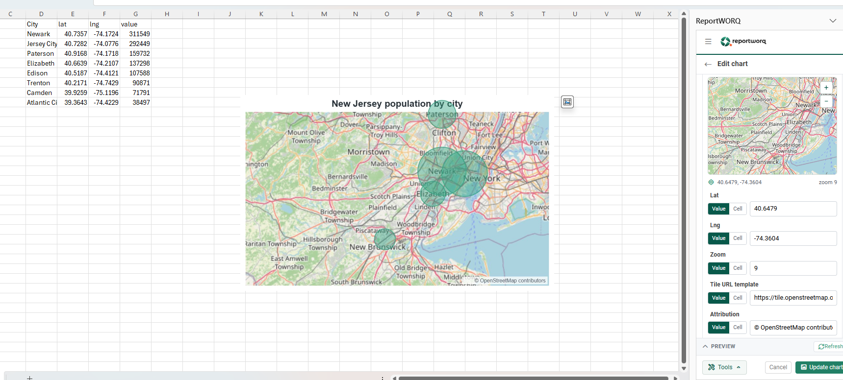
Which field wins. If both Lat and Lng resolve to numbers, they position the map and any search term is ignored. Otherwise Search centers it. The two are not mutually exclusive, so you can set both and let that rule decide.
That gives you two complementary ways to say where the map should look, and a third field that decides how close it gets.
1. You have coordinates. Bind Lat and Lng to cells holding latitude and longitude. This is the most precise option and the natural fit when your data already carries coordinates.
2. You only have a place name, so search for it. Bind Search (auto-center) to a cell instead. If your data says revenue in New Jersey or headcount in Newark, put New Jersey or Newark in a cell and bind Search to it. Reportworq looks the place up and centers the map on it, with no coordinates required. Because the search term is only a cell, it is fully data-driven: change the cell, or let a burst supply it, and the map moves.
3. Zoom from a lookup table. Search finds a place, but it does not decide how close to get. Zoom is resolved independently, and an unset zoom falls back to a wide default view whatever you searched for. So bind Zoom to a cell as well.
The real payoff is a small lookup table of your own that pairs each location with the zoom that frames it best. Keep it on the worksheet, look up the current location's row with an ordinary Excel lookup, and bind Zoom to the result:
| Location | Zoom |
|---|---|
| North America | 3 |
| Northeast region | 6 |
| New Jersey | 8 |
| Newark metro | 11 |
| Ironbound district | 14 |
Now a run for a dense city zooms in tight while a run for a sprawling region pulls back, each framed correctly, without hand-tuning every map.
Put the three together and one map definition serves a whole burst set. The burst supplies the location into a cell, Search recenters the map on it, the zoom lookup picks the right altitude, and the marker or bubble layer redraws from that location's rows. Every recipient gets a map framed for their own place, from a single authored chart. See Burst sets.
Rules for map cell references#
Map framing fields are stricter than the other bindings, because each one resolves to a single value rather than a range:
- A framing field must reference a single cell, not a range or a named range.
- That cell must be on the current sheet. A reference to another sheet is refused with a message naming the sheet you are on.
Category, series, title, and the marker and bubble tables are not restricted this way. They may point at another worksheet.
Tile source (advanced)#
Tile source (advanced) is collapsed by default and rarely needs changing. It holds two fields, both of which also take a Value | Cell toggle:
- Tile URL template, which defaults to the standard OpenStreetMap raster tiles.
- Attribution, the credit line drawn in the corner of the map, which defaults to the OpenStreetMap contributors credit.
Change these only if your organization serves its own map tiles. The attribution credits the tile service, so change that text only when you have changed the tile source.
Map notes and limits#
- A tile map is a static image inside Excel. You frame it live in the task pane; the sheet holds the stitched picture, not a map you can pan.
- Zoom is a whole number. The field suggests 2 to 18. A fractional value is rounded, and a value outside the supported range is brought back into it.
- A point outside the framed area is not drawn, and nothing warns you. Choose the zoom against the actual spread of your points, not only the center.
- Real tiles and place-name search both need outbound HTTPS from the server to the tile and lookup services, at preview time and again at refresh time. If they are unreachable, the map falls back to a plain grid canvas with your marker and bubble layers intact and correctly positioned.
- A failed place lookup keeps the previous center rather than reporting an error. A map centered on the wrong place looks exactly like one that worked, so check the picture after a run that introduced a new location.
How a chart stays current#
An imported chart or map is a picture that carries its own definition, so a refresh reads the definition back, re-reads the bound ranges, and redraws.
In Excel, refresh is something you ask for. The picture is a visualization, not a live Excel chart object: it does not respond to pointing or selection, and it does not redraw as you type. Use Refresh chart on a single chart, or the workbook-level Refresh, to bring it up to date.
On a job run it is automatic. Reportworq redraws every Reportworq chart on the workbook from the current cell values, with no one opening Excel. A series or a map field bound to a formula reads the calculated result, so charts see the same numbers the rest of the report does.
Three further behaviors follow from the design:
- Resize the picture, then refresh, to redraw at the new dimensions. Stretching the picture on its own scales the existing image; refreshing redraws the visual at the size the picture now occupies, which corrects the proportions and sharpens it.
- Job output is drawn at three times the on-sheet size, so a chart stays sharp in a PDF, in a PowerPoint deck, and on screen when someone zooms in.
- A replicated worksheet's charts follow their own copy. When a worksheet is replicated for a burst, one copy per parameter value, each copy's chart re-points at its own sheet, so every page shows its own data rather than repeating the first page's. A binding you deliberately pointed at a different sheet is left exactly as authored.
Authoring aids#
Tools at the foot of the builder holds three helpers.
| Tool | What it does |
|---|---|
| Create with AI | Select a block of data and Reportworq works out which column is the category and which are the series, then fills in the bindings. Needs a configured AI model; without one a fixed rule is used instead. |
| Sample Data | Writes a ready-made example dataset onto the sheet and configures the form to plot it, so you can see the shape a type expects. The samples cover quarterly revenue, sales by region, revenue by segment, channel mix, stock price, market share, cash flow, revenue and margin, sales pipeline, New Jersey population on a tile map, and a grocery floor plan image map. |
| Use named ranges | Converts every cell and range binding on the current screen into workbook named ranges, so the chart keeps pointing at the right data when rows or columns are inserted or deleted. It confirms first, lists what it will convert, and tells you when there is nothing to convert. |
Create table appears beside the bindings that expect a table of a specific shape, on maps, Sankey, and heatmap. It writes a correctly headed template at the active cell and binds it.
Notes and limits#
- Charts and maps are imported as pictures, not live Excel chart objects. This surface is a prototype: imported visuals are not yet versioned or permissioned as report objects the way a report is.
- A chart depends on its bound ranges still holding what it expects. If a report import changes the shape of the data underneath a chart, re-check the binding. Use named ranges makes this less likely.
- Category axis labels are shortened to about eight characters when they are drawn, and legend entries to about 14. Keep the labels on the chart short; the data sheet can keep the full names.
- A chart can live on a different worksheet from its data. Bind through the range picker, which returns a sheet-qualified address, or through a workbook named range.
- A definition that cannot be read is skipped silently, leaving the previous image in place. If a picture stops updating while others refresh, rebuild it from the builder.
Going deeper. For how these visuals compare with native Excel charts, and when to reach for each, see Charts and maps. The same add-in loads in PowerPoint, where a slide shape can be linked to a chart in the Excel report, see PowerPoint reporting. For how a refreshed report is distributed, see The report lifecycle.
Feedback on this page
Comments, questions, requests, or something missing or unclear? Email us - the page you are on is filled in for you.
Email feedback on this pageOr write to support@reportworq.com directly.